
The Process
As I designed and created the Thrift prototype, I went through a lot of trial and error, user feedback, and aesthetic changes. I first made app wireframes showcasing a rough sketch of the app layout and what would be on it.
Wire Frames


Before and Afters
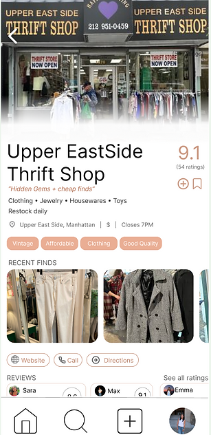
POP UP SCREEN
I chose to focus each store pop up screen more so on thrifting and what they had to offer than the actual store itself. I had originally drawn from Google Maps for inspiration and found the product to focus less on thrifting than I intended. Therefore, I chose to change it to highlight what the store has to offer and other thrifting elements.

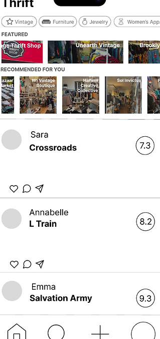
HOME PAGE
Drawing from peer feedback, I made the home screen two pages instead of just one. I allowed the user to switch from the "For You" page to the "Friends" page where you could see friend reviews and ratings while also seeing the featured/recommended options around you. This way, the page remains less cluttered and allows the user to find and see stores more easily rather than sorting through the Friend feed and the Featured feed.

